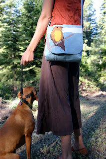
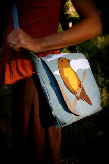
 |
| Before |
 |
| After |
I called this post Posting Great Pics instead of Taking Great Pics on purpose. Unless what you are selling is your photography, it is pretty easy to turn a mediocre photo into a great one to post on your blog.
You can see in the photo above that my original was nothing special to look at. It is a little bit washed out, the colors aren't great and the focal point isn't really the bag. After a few really quick alterations; the photo is more visually appealing and your eye is drawn to the bird on the bag where it is supposed to be. For the Birds Messenger Tote
I get comments all the time from people telling me how great my photos are and asking me if I could give some tips on how to take better photos. I decided that I should do a tutorial and give away all my secrets.
The most important elements- I have divided the tutorial into three parts and will post it over the next three days.
- Background and Setting- The background is part of your story. If you have an ugly background you are going to have a hard time making your items look good. A photo of an item alone is BORING without a set up. A white wall? They stage photos in magazines for a reason.
- Lighting- Lighting is important. It really is true that you can take better photos in the morning and evening because of the low angle of the sun. There are little ways to cheat this though.
- Photo Editing Program- Even professional photographers touch-up their photos.
Background and Setting
I posted the photo below left to twitpic right after I finished my For the Birds Messenger Tote. It was late and I was excited, I wanted to share it with the world. The photo isn't bad, the bag actually looks pretty good, but it doesn't look professional at all. I want to sell the things I make and I want people to know that this is what I do, I'm good at it and I take it seriously.
 |
| Posted to Twitpic |
 |
| Pro Shot |
 |
| Cutest Puppy Ever |
That doesn't mean that I never post a bad pic. I posted a pretty bad one of my dog wearing some pants I made. The difference is, I'm not selling those pants. I posted that because it was funny and cute! When your photos are the focus of what you are posting, they are too important to not do the job right.
If all my photos looked like the photo I posted to twitpic no one would ask me about my photos, less people would be interested in the items I make, and my blog stats would drop significantly.
What makes a great background is going to be different for everyone and to some extent be determined by your subject. My bags and wallets would work in an urban setting, but I love the outdoors and the lighting of natural settings. Your personality and the atmosphere you are trying to achieve for your blog should determine the background and setting of your shots.
For some people a plain black background achieves the look they are after. It works for them, not for me. Lighting and equipment play a bigger part when you are trying to get that professional black background look.
Setting is more than just the background though. Photographing your items being used in the way they are intended is much more compelling.
 |
| Beige Bag |
 |
| Red Flower Tote |
 |
| RW&B Wallet |
What your model wears is important too. I am the "model" for all my photos, I make sure to wear something that looks good with each individual item. If I am taking photos of five different items, I will wear five different outfits if I need to. At first I felt really self conscious as the "model" for my items, especially since we have been known to parade through the neighborhood looking for good light. My neighbors might think I'm conceited, or maybe they think they live next door to an actual model, wouldn't that be funny! The reality is, if you look through my photos here, I'm not really in them. I'm just part of the background.
If your item is earrings, make sure to do your hair up. If you are selling stuffed animals or dolls, put them on a bed or in a child's arms. Food goes on a nice plate with all the drips and crumbs cleaned up, make a fake table setting or show in-progress steps.
These crepes look good! I used to post my recipes on another blog, this was one of my faves. I plated this one special for the photos making sure to drizzle the honey and sprinkle the chocolate exactly where I wanted it.
My friend Kim has some fantastic photos on her food blog, Affairs of Living. Claire Ogden does a great job making her jewelery pop with a simple wood background, Claire Ogden Designs.
Your photos more than your words will entice people into your blog. A good photo can inspire someone to read a post, or to ignore a post. Words are words, they don't look interesting in themselves. How you write might keep someone reading, but first you have to get them to stop and have a look at what it is you are writing about.
 | |
| Nice, but blurry |
 |
| Boring and bad lighting |
 |
| My Style |
This is part one of my three part tutorial on how to make better photos to post on your blog. Make sure to check out all the Posting Great Pics posts.
Posting Great Pics -- Tutorial Part 2, Lighting
Posting Great Pics -- Tutorial Part 3, Photo Editing

I have been attempting to get into photography, but working full time, sewing, and laying in bed, doesn't give me enough time to focus on it. I take a little at a time. I use photoshop elements to edit my photos. Thanks for the great post and for following my blog.
ReplyDeleteWow, this is actually pretty good tips for photography. I've always loved photography. I'm the designated picture taker for my family. But if I take into account what you wrote, some of them might actually suitable for framing.
ReplyDeleteHey, I"m late to the game here, catching up with your photo tips. Boy do I need these! thanks Ashley!!
ReplyDelete